08 May, 2010
07 May, 2010
Final Design - MACHINE Double Page Spread
 The above image is my final double-page spread design for my MACHINE magazine that focuses on the genre of metal. I took design inspiration from my previous analysis' of double-page spreads from the existing magazine industry.
Bibliography:
City Scene
 The above image is a screenshot taken from within Photoshop CS2 - the software package I utilised in order to produce the work. As you can see, I have made as much 'behind the scenes' material visible as possible.
Final Design - MACHINE Contents Page
 The above image is my final contents page design for my MACHINE magazine that focuses on the genre of metal. I took design inspiration from my previous analysis' of contents pages from the existing magazine industry.
 The above image is a screenshot taken from within Photoshop CS2 - the software package I utilised in order to produce the work. As you can see, I have made as much 'behind the scenes' material visible as possible.
 Final Design - MACHINE Front Cover
 The above image is my final front cover design for my MACHINE magazine that focuses on the genre of metal. I decided to include such bold elements as the Future Publishing logo and slogan "The United Kingdom's Best Selling Metal Magazine" to make the overall production feel much more 'real', and also to further display how typical mainstream magazines use wordplay to grab the attention of their target audience.
I used valuable information gained from analysing front covers from Metal Hammer and Kerrang! magazines to accurately gauge what my target audience is looking for when it comes to aesthetic and language qualities within the realm of magazine publishing.
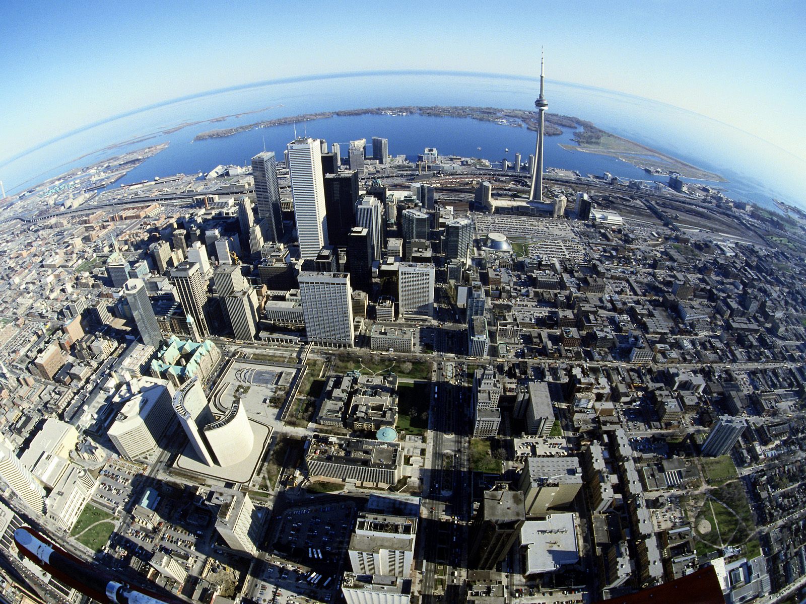
Other than Soulfly and In Flames, I created all of the band titles myself; this was not only a creative process that was fun to engage in but a hyperbolic play on what I believe to be typical metal band names that get churned out of the music industry. I let the photograph of choice (of which I took myself) dictate the colour scheme - which is evidently shades of red, brown, black and white. I manipulated the stock image of the cityscape to follow the scheme, likewise.
One minor change to be noted is the shortening of the magazine name; instead of "The Machine" I decided to make it as minimalist as possible. This not only gives me as a designer more room to fill one word in with, but as a reader it will much more memorable due to it's decisiveness.
Bibliography:
City scene (background)
Future Publishing logo
Barcode image
Image of Tickets
The above list details the source location of images I manipulated in order to achieve the final design; as is evident I moved as far away as possible from relying on stock images - not created by myself - to serve as the focal point of the design, and therefore made the cover 'my own' creation.
 The above image is a screenshot taken from within Photoshop CS2 - the software package I utilised in order to produce the work. As you can see, I have expanded the Layers tab to show as much 'behind the scenes' material as possible; noting the speciality language regarding magazine design such as "Masthead", "Banner" and "Headline".
Band Photography - Soilborne at the Abbey Cathedral


 Note: I uploaded the above photographs to my Photobucket account, as due to the large file size the process would be a lot quicker than waiting for Blogger to upload it straight from my PC.
04 May, 2010
Magazine Analysis - 'Metal Hammer' Double Page Spread
 The above image is my first double page spread analysis taken from Metal Hammer. Clicking the thumbnail will enlarge the image.
10 March, 2010
Design - Magazine Logo Ideas
 These are just some of the magazine name and logo designs that I have roughly created. Before I activate a poll for the general public to choose their favourite, I will be making more varied designs to make sure I have exhausted all angles of design to do with magazines covering the genre of metal. The following is a very brief explanation of each of the above four logo designs:
- #4 is my personal favourite out of the four, although the font might not the best for the job.
- #3 was inspired by Q magazine, and it would likewise be placed on the top left corner on each edition - possibly changing the rust effect to whatever suits the main photo each week.
- #2 looks a bit of a mess, but leaves a lot of room to comfortably fit sub-titles between the letters that stick out.
- #1 was inspired by the Total Guitar and Classic Rock magazine, so the chosen font might be way off, but the placement and 3D effect of the two words is more what I was experimenting with.
09 March, 2010
Research - Magforum.com
08 March, 2010
Photoshop Practise #2

I utilised text from Wikipedia for the article, and took quotes from the official DVD the group has released. "Steadily shine in '10" is a play on the groups' famous line "Steadily shine in '99", from their hit single "Heavenly Divine". I made sure to include several integral elements to magazines such as puffs to make it look as professional as possible.
05 March, 2010
Photoshop Practise #1

 The above image took approximately 30 minutes to complete; this was because I didn't plan what I was going to edit before starting, and so ended up changing my mind several times before settling on the current version. My image shows evidence of minimal skill in areas of photo manipulation (far right face and ring has been removed), as well as simply a good eye for "what looks right". The below links will direct you to the images I took advantage of to produce the piece of work.
I used this image for the far right face manipulation.
I used this image for the blood splatters.
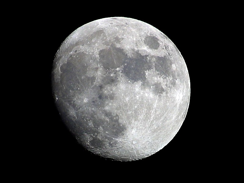
I used this image for the moon in the background.
01 March, 2010
Magazine Specification
- The design is to be targeted at a male audience.
- Likewise, the age range is roughly of 17-19 year olds.
- Current magazines that have a similar genre are Metal Hammer and NME - I will use these for inspiration.
- ..Out of the two, Metal Hammer was labelled 'metal' more frequently, therefore the best out of the two to rely on regarding layout, photo dynamics, magazine name, etc.
- The double page spread is to have new album news and an interview of the band.
- One comment that stood out - from the final open question - was that editors of articles can be too obviously opinionated or biased - I will try to write a fair but unique article bearing this in mind.
18 February, 2010
Audience Expectations - Questionnaire Conclusion
 The above image - once clicked - displays my findings in their entirety and will therefore be the base from which I make the following conclusions. For the interest of validity I have decided to declare the second answer in both cells E8 and F8 void; this is because I stated clearly that the participant of my questionnaire should choose just one answer, and their most preferred at that. I will therefore take the first answer out of the two as their actual entry into the results - as crude as it is, I do not have sufficient amount of entries to simply disregard them completely.


Question 6 - What do you like about this (/your chosen) magazine?
Articles and news coverage - 7
General appearance - 3
Artists covered and interviewed - 9
Branding - 1
General gossip - 3
Tour news - 4
New album news - 7
Exclusive album news - 1
More band interviews - 8
I wouldn't - 1
Improved appearance - 1
More album news and reviews - 3
15 February, 2010
Mood Board - Metal & Magazines
 Mood boards are primarily created to develop design concepts and to communicate to others the direction in which the project is heading. Applying this to my coursework; the above mood board I produced visually displays the type of clothes, photo shoot dynamics and general feel that I will be attempting to mimic with my own creation. I used elements of magazine covers to converge the two topics of metal bands and magazines. Click the above thumbnail to maximize the image.
What I have taken from this mood board:
- Dark coloured clothing is typically worn by band members
- Long hair is a lot more common than short (although this is not normally orchestrated)
- Apathetic or aggressive expressions are typically worn by band members
- Although most camera angles have been used for metal band photos, the most dominate one featured in my mood board is a simple mid-shot.
Magazine Analysis - 'NME' Contents Page
 The image above is my second contents page analysis. This time i have analyzed a page from NME; although not typically thought of as a metal magazine, bands of the genre are commonly featured inside and so it is justified. Clicking the thumbnail will maximize it.
11 February, 2010
Magazine Analysis - 'Kerrang!' Contents Page
 The above image is my first contents page analysis. It is from the magazine Kerrang!, and clicking the above thumbnail will maximise it.
Magazine Analysis - 'Kerrang!' Front Page
 This is my second analysis of a magazine front cover, this time on Kerrang! Clicking the above thumbnail will maximise the image.
Magazine Analysis - 'Metal Hammer' Front Page
 This is my first analysis of a magazine front cover - Metal Hammer. Clicking the thumbnail above will maximise the image.
College Newsletter Analysis - Revised Front Page
 This is my final version of the Deyes College newsletter. The reasons for choosing the various elements and layout can be read in the post below titled "College Newsletter Analysis - Mock-up Front Page". Click the above thumbnail to enlarge the image.
18/02/2010 - On reflection, there are a few design choices I initially made to produce this newsletter revision that I now believe were not the best to make. To elaborate:
The duplicate school logos placed either side of the top banner are not only of bad quality (rough edges) but unnecessary - only one logo is needed as an image anchor. Ink/cost trumps symmetry as the newsletter is handed out for free (does not need to aesthetically please consumers).
Keeping on the subject of the banner; "DEYES HIGH" does not fully align with the below "NEWSLETTER" sub-title. This is a minor grievance, but I feel it retracts from the overall professionalism the design portrays.
Moving down the page, my choice of puff positioning (the left-aligned article titles) go against conventional design. Typically the main article title is placed at the very top of the list, subsequently listing the less important articles below. Although not necessarily a bad decision, I personally believe it would simply look a lot nicer than my current placement.
Finally; the blue translucent box that houses the main article title is clearly too big height-wise - a considerable amount of empty space can be seen. This is a clear error regarding refinement.
With this final analysis of my college newsletter revision I have expanded my placement and design knowledge, and will bear it all in mind when creating my music magazine pages.
College Newsletter Analysis - Mock-up Contents Page
 Above is the mock up I produced for my version of the Deyes College contents page. A simple design, following on from the same uniformed colour scheme and layout, was deemed appropriate by myself to fit the purpose of a school newsletter.
College Newsletter Analysis - Mock-up Front Page

Above is the mock up I produced for my version of the Deyes College newsletter. Despite my earlier analysis of the current newsletter – stating that it does not need to be changed – I decided to create my own version to practice using software such as Microsoft Publisher, and also the concepts of magazine layouts and presentation. For this reason I aimed it at a more particular audience, namely that of high school students (roughly between 11-17). Because of this I inserted a large image of a student who attends the school, and put less emphasis on the professionalism of the school being a special science college. The main colour of the cover is obviously blue; it is known to give connotations of loyalty and calmness – retaining at least some elements of the school’s ‘Proper’ image that it would no doubt want to retain.
28 January, 2010
College Newsletter Analysis - Existing Front Page
 This analysis serves as research towards creating my own version of a school newsletter. Clicking the above thumbnail will maximize the image.
Key Terms - Magazine Layouts
House Style: A magazine's distinctive design that distinguishes it from its competitors.
Banner: Text which stands out on a coloured background - normally situated at the top of the page.
Masthead: The actual name of the magazine.
Headline: Catchy Title for the main article.
Motto: A memorable phrase that is recognisable to a particular brand.
Strap Line: Also known as a slogan.
Pugs: These are placed at the top right and left corners of the page and are known as the 'ears'. Examples of content that is placed here is the price of the product, the logo or a promotion.
Copy: The Main Story in the Magazine.
Puffs: Boxes that promote features found inside.
Sell Lines: Persuasive text on the front cover that helps to sell the magazine to the audience.
Anchorage Text: Text that helps pin down the meaning of a picture (and vice versa).
Caption: A clear description of an image.
Buzz Words: "Free", "Exclusive" and "Wow" are all examples. They attract the readers attention.
Drop Capitals: Really big letter that starts off an article.
Lead: The introductory paragraph of an article. This is Usually written in bold or CAPITALS.
25 January, 2010
Audience Expectations - Magazine Questionnaire
Please fill out my questionnaire so that I have as big a pool of results as possible.
20 January, 2010
Chosen Genre: Metal
The following are typical photos you would see of a metal band:

18 January, 2010
Coursework To-Do List
To complete my AS Media Studies coursework I must complete the following tasks:
- Analyse an existing college magazine
- Produce images for my own version of a college magazine
- Post my finished and evaluated College Magazine
Music Magazine Project
- Choose my genre of music
- Set up an online questionnaire
- Research my target audiences expectations
- Analyse two music magazine front covers
- Analyse two music magazine content pages
- Analyse two music magazine double page spreads
- Post mood boards for my genre, costume and mise en scene
- Research what Institutions publish music magazines

