The above image is my final double-page spread design for my MACHINE magazine that focuses on the genre of metal. I took design inspiration from my previous analysis' of double-page spreads from the existing magazine industry.
Bibliography:
City Scene The above image is a screenshot taken from within Photoshop CS2 - the software package I utilised in order to produce the work. As you can see, I have made as much 'behind the scenes' material visible as possible.
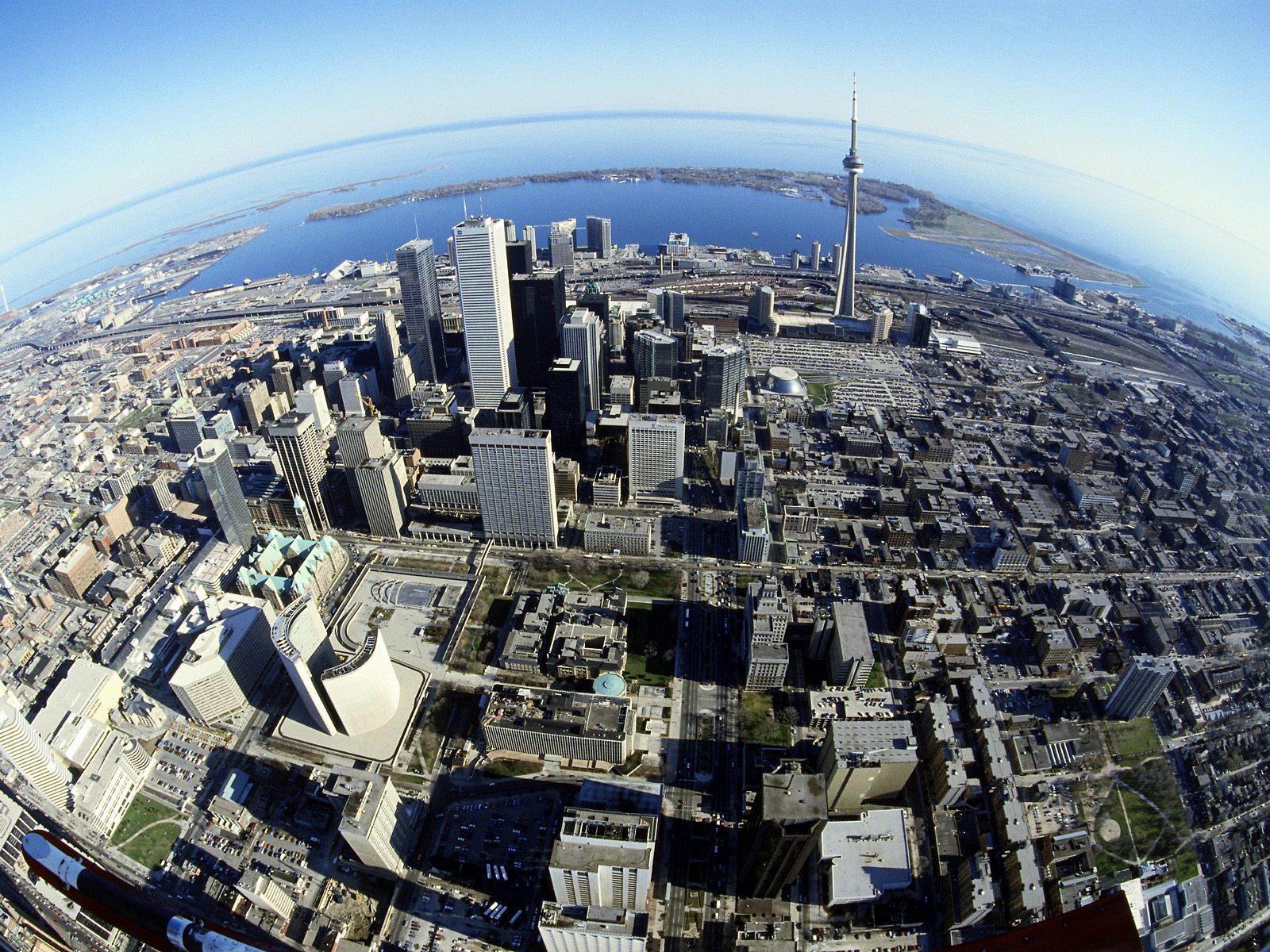
 The above image is my final front cover design for my MACHINE magazine that focuses on the genre of metal. I decided to include such bold elements as the Future Publishing logo and slogan "The United Kingdom's Best Selling Metal Magazine" to make the overall production feel much more 'real', and also to further display how typical mainstream magazines use wordplay to grab the attention of their target audience.I used valuable information gained from analysing front covers from Metal Hammer and Kerrang! magazines to accurately gauge what my target audience is looking for when it comes to aesthetic and language qualities within the realm of magazine publishing.Other than Soulfly and In Flames, I created all of the band titles myself; this was not only a creative process that was fun to engage in but a hyperbolic play on what I believe to be typical metal band names that get churned out of the music industry. I let the photograph of choice (of which I took myself) dictate the colour scheme - which is evidently shades of red, brown, black and white. I manipulated the stock image of the cityscape to follow the scheme, likewise.One minor change to be noted is the shortening of the magazine name; instead of "The Machine" I decided to make it as minimalist as possible. This not only gives me as a designer more room to fill one word in with, but as a reader it will much more memorable due to it's decisiveness.Bibliography:City scene (background)Future Publishing logoBarcode imageImage of TicketsThe above list details the source location of images I manipulated in order to achieve the final design; as is evident I moved as far away as possible from relying on stock images - not created by myself - to serve as the focal point of the design, and therefore made the cover 'my own' creation.
 The above image is a screenshot taken from within Photoshop CS2 - the software package I utilised in order to produce the work. As you can see, I have expanded the Layers tab to show as much 'behind the scenes' material as possible; noting the speciality language regarding magazine design such as "Masthead", "Banner" and "Headline".
 This is my final version of the Deyes College newsletter. The reasons for choosing the various elements and layout can be read in the post below titled "College Newsletter Analysis - Mock-up Front Page". Click the above thumbnail to enlarge the image.18/02/2010 - On reflection, there are a few design choices I initially made to produce this newsletter revision that I now believe were not the best to make. To elaborate:The duplicate school logos placed either side of the top banner are not only of bad quality (rough edges) but unnecessary - only one logo is needed as an image anchor. Ink/cost trumps symmetry as the newsletter is handed out for free (does not need to aesthetically please consumers).Keeping on the subject of the banner; "DEYES HIGH" does not fully align with the below "NEWSLETTER" sub-title. This is a minor grievance, but I feel it retracts from the overall professionalism the design portrays.Moving down the page, my choice of puff positioning (the left-aligned article titles) go against conventional design. Typically the main article title is placed at the very top of the list, subsequently listing the less important articles below. Although not necessarily a bad decision, I personally believe it would simply look a lot nicer than my current placement.Finally; the blue translucent box that houses the main article title is clearly too big height-wise - a considerable amount of empty space can be seen. This is a clear error regarding refinement.With this final analysis of my college newsletter revision I have expanded my placement and design knowledge, and will bear it all in mind when creating my music magazine pages.
 The above image is my final double-page spread design for my MACHINE magazine that focuses on the genre of metal. I took design inspiration from my previous analysis' of double-page spreads from the existing magazine industry.
 The above image is a screenshot taken from within Photoshop CS2 - the software package I utilised in order to produce the work. As you can see, I have made as much 'behind the scenes' material visible as possible.


 Posts